Bar Graphs- Simple, Stacked, Back-to-Back - P4 |

|
|
Bar Graphs- Simple, Stacked, Back-to-Back - P4
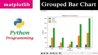
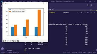
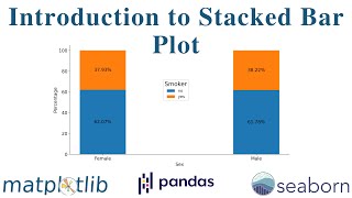
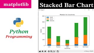
Topics to be covered 1. Plotting simple Bar Graphs -- Completed 2. Plotting Stacked Bar Charts -- Completed 3. Plotting Back-to-Back Bar Charts Code Starts Here ============== import pandas as pd import numpy as np import matplotlib.pyplot as plt df = pd.read_csv('train.csv') # Plot the simple Bar Charts X = [7, 28, 45, 65] plt.bar(range(len(X)),X) plt.show() survived_by_class = df.groupby('Pclass')['Survived'].mean() survived_by_class.plot(kind='bar',color='g',title = 'Survival Rate by Class', sharey=True) plt.show() survived_by_sex = df.groupby('Sex')['Survived'].mean() survived_by_sex.plot(kind='bar',color='g',title = 'Survival Rate by sex', sharey=True) plt.show() survived_by_age = df.groupby('Age')['Survived'].mean() survived_by_age.plot(kind='bar',color='g',title = 'Survival Rate by Age', sharey=True) plt.show() survived_by_embarked = df.groupby('Embarked')['Survived'].mean() survived_by_embarked.plot(kind='bar',color='g',title = 'Survival Rate by Embarked', sharey=True) plt.show() ''' Plotting Stacked Bar Charts ''' X = [7, 28, 45, 85] Y = [5, 22, 35, 15] range1 = range(len(X)) plt.bar(range1,X,color='b') plt.bar(range1,Y,color='y') plt.title(' X V/s Y') plt.show() table = pd.pivot_table(data=df,values='PassengerId',index='Pclass', columns='Survived', aggfunc='count') print(table) bar1 = table[0] bar2 = table[1] x_len = np.arange(len(bar1)) firstbar = plt.bar(x_len, bar1, 0.6, color = 'r') secondbar = plt.bar(x_len, bar2, 0.6, color = 'g',bottom=bar1) plt.xticks(x_len+0.09, ('Pclass1','Pclass2','Pclass3')) plt.legend() plt.title('Survived') plt.show() ''' Plotting Back-to-Back Bar Charts ''' X = np.array([7, 28, 45, 85]) Y = np.array([5, 22, 35, 15]) n = np.arange(len(X)) plt.barh(n , X, color = 'r') plt.barh(n, -Y, color = 'b') plt.show() table = pd.pivot_table(data=df,values='PassengerId',index='Pclass', columns='Survived', aggfunc='count') print(table) bar1 = table[0] bar2 = table[1] x_len = np.arange(len(bar1)) firstbar = plt.barh(x_len, bar1, 0.6, color = 'r') secondbar = plt.barh(x_len, -bar2, 0.6, color = 'g') #plt.xticks(x_len+0.09, ('Pclass1','Pclass2','Pclass3')) #plt.legend() plt.title('Survived') plt.show() All Playlist of this youtube channel ==================================== 1. Data Preprocessing in Machine Learning https://www.youtube.com/playlist?list=PLE-8p-CwnFPuOjFcbnXLFvSQaHFK3ymUW 2. Confusion Matrix in Machine Learning, ML, AI https://www.youtube.com/playlist?list=PLE-8p-CwnFPvXzvsEcgb0IZtNsw_0vUzr 3. Anaconda, Python Installation, Spyder, Jupyter Notebook, PyCharm, Graphviz https://www.youtube.com/playlist?list=PLE-8p-CwnFPsBCsWwz_BvbZZHIVQ6wSZK 4. Cross Validation, Sampling, train test split in Machine Learning https://www.youtube.com/playlist?list=PLE-8p-CwnFPsHtol5WXHhq_B3kQPggHH2 5. Drop and Delete Operations in Python Pandas https://www.youtube.com/playlist?list=PLE-8p-CwnFPtvqVVK7QVFsMvDvp2YgCnR 6. Matrices and Vectors with python https://www.youtube.com/playlist?list=PLE-8p-CwnFPsndwnZnL7nXW5mIrdRmgdg 7. Detect Outliers in Machine Learning https://www.youtube.com/playlist?list=PLE-8p-CwnFPvyCX35yES5D9W7vThiUzwk 8. TimeSeries preprocessing in Machine Learning https://www.youtube.com/playlist?list=PLE-8p-CwnFPv10bru3719xzDNIgbO6hXA 9. Handling Missing Values in Machine Learning https://www.youtube.com/playlist?list=PLE-8p-CwnFPvOec0LZ40Bt8OQcbLFa236 10. Dummy Encoding Encoding in Machine Learning https://www.youtube.com/playlist?list=PLE-8p-CwnFPvu7YriqMZsL9UDbqUUk90x 11. Data Visualisation with Python, Seaborn, Matplotlib https://www.youtube.com/playlist?list=PLE-8p-CwnFPuYBYsmbfMjROOCzKjCwyMH 12. Feature Scaling in Machine Learning https://www.youtube.com/playlist?list=PLE-8p-CwnFPtwpVV3FwzwYZYR5hT3i52G 13. Python 3 basics for Beginner https://www.youtube.com/playlist?list=PLE-8p-CwnFPu-jseUMtc4i47jQZN4PNbf 14. Statistics with Python https://www.youtube.com/playlist?list=PLE-8p-CwnFPta0COlxS6E5u14m5ouzbRU 15. Sklearn Scikit Learn Machine Learning https://www.youtube.com/playlist?list=PLE-8p-CwnFPtAGb29r8F7up9ilZUXt3l1 16. Python Pandas Dataframe Operations https://www.youtube.com/playlist?list=PLE-8p-CwnFPv_63lkT_Tztiwknv_zGTNy 17. Linear Regression, Supervised Machine Learning https://www.youtube.com/playlist?list=PLE-8p-CwnFPslDi6sfFbFK4KXcVlLwaOM 18 Interiew Questions on Machine Learning and Data Science https://www.youtube.com/playlist?list=PLE-8p-CwnFPt7VBhcnh82y0autSzuOrZp 19. Jupyter Notebook Operations https://www.youtube.com/playlist?list=PLE-8p-CwnFPtqkFd67OZcoSv4BAI7ez5_ |


![Bar Graphs in Python | Pandas Bar Plots [Matplotlib Tutorial Part 2]](https://ytimg.googleusercontent.com/vi/AR2bLFXycf4/mqdefault.jpg)